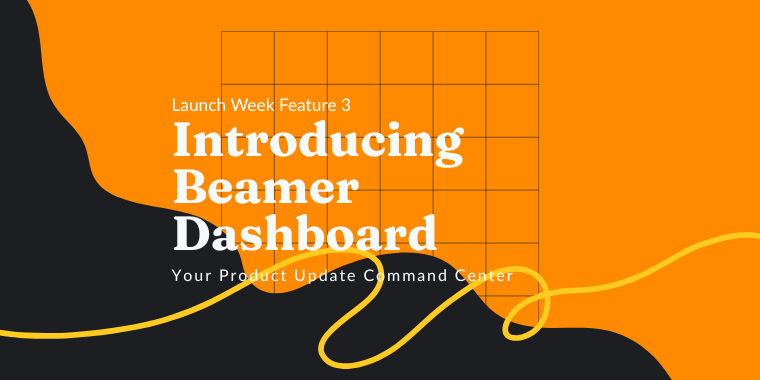
Pop-ups used to be considered a nuisance connected to cheap products, shady sites, malware, and ugly design. Some still do. But what if I could tell you that your SaaS company can harness the power of pop-ups and use them not only for good but also for growth? 😇

Pop-ups, when done right, can be valuable assets for any SaaS company. And despite their bad reputation and disapproval ratings, the numbers say otherwise: pop-ups work!

In this article, we’ll examine different types of pop-ups, the dos and don’ts of using them, and real-life examples of implementation. Let’s get ready to pop-upping the right way! 🤣

Photograph of origami envelope

Here’s how to use pop-ups for SaaS to increase engagement and boost growth

What is a pop-up?

Pop-ups (sometimes called modals, overlays, and tooltips) are emergent windows that advertise content, products or try to push the users to take an action (for example click, submit your email address, subscribe, or upgrade).

The advantages of pop-ups

Past experiences have shown that harnessing pop-ups the right way can get you up to 1375% more subscribers and an average conversion rate between 3 and 9.28%. Those may seem small numbers at first but think at a large scale. 🤑

Pop-Up Conversion Rates

To achieve those numbers though, you’ll need to create pop-ups that users would want to click on.

The main advantages of pop-ups in comparison to other types of advertising:

  1. Pop-ups are contextual. Unlike other kinds of ads and communication tools, pop-ups live right on the content. They appear inside the article you’re reading or right in the middle of an onboarding process.
  2. Pop-ups are eye-catching. Pop-ups pop… up, hence the name! With animations, the right placement, and good design, your pop-ups will be unavoidable, in a good way. They’ll catch all the looks!
  3. Pop-ups are actionable. Pop-ups promote explicitly a specific behavior. With the right call-to-action, pop-ups can take your users to wherever you may need them in a single click. They are also versatile as you can use them to get feedback, sign-ups, and many other actions that a common ad would not be able to achieve without extra clicks.


The 3 DOs and 3 DON’Ts of pop-ups for SaaS

DON’Ts

  1. Don’t clutter. Don’t use too many pop-ups at once! Plan when and where to show them correctly or your site will scare everyone off.
  2. Don’t stalk. Don’t send pop-ups for any content you upload. Curate, segment, and use them just for specific cases.
  3. Don’t mislead. Make any call-to-action clear and all pop-ups actionable. Users need to understand what you want them to do, and what will happen when they do.

DOs

  1. When possible, allow opt-ins and opt-outs. Let your users agree to see or hide pop-ups. Especially if those pop-ups are too many, or related to a long-term commitment. That will personalize their experience and guarantee that they see pop-ups that are better suited to their interests.
  2. Wait for the next time! If a user closes a pop-up, don’t show it over and over, even if they do the same action again. Use cookies if possible to schedule the next time the pop-up will appear or allow them to select an option to “not show again”.
  3. Make it easy. Even when done the right way, pop-ups may disturb the navigation or browsing of your users. So avoid building walls and create doors. All pop-ups need to have well-marked exits like a close button and a simple action to complete the desired behavior. Pop-ups need to be simple and engaging, never restricting.

Useful pop-ups examples

Content recommendations

Content recommendations are pop-ups that advertise related content. They are ideal for blogs and other content-based sections on your sites. If you have content you need your users to see, these are the right choice.

Photograph of an arrow made of paperclips

  • Good for self-service. Content recommendations are excellent for a self-service model. Users like to find information by themselves and a well-placed pop-up with related content may entice them to keep reading and spending time on your site.
  • Related to the context. Content recommendations need to be attractive for any user that sees them. If pop-ups are devoid of information or unrelated to the context, users won’t click and probably will think of them as a disruption instead of a helpful suggestion.
  • Curation and segmentation. You can curate pop-ups based on the page they are appearing in (like related posts, similar documentation topics, or content with similar tags), or use segmentation based on data you have about your user (like user history, cookies, purchase history, demographics).

YouTube is the living proof that you can include different types of content recommendation pop-ups in different moments of the user experience. While you watch a video you can see an ad or a card in the top-right corner of the screen. At the end of the video, you’ll be offered a selection of more videos to watch. That way, YouTube promotes a continuous watching experience.

Youtube pop up

You can do the same with in-app announcements and notifications. You can tease must-see content with a non-intrusive pop-up window or tooltip. That way your users will be intrigued to stay and keep reading. Include an eye-catching image and an attractive excerpt that will lead your users from one part of your site or app to another. Ideal for SaaS companies that want to show up new features or help articles.

For an easy, no-code required way to implement pop-ups in your app or website you can use Beamer. Beamer is a changelog to announce latest updates, product changes or news to your users or visitors. With just one click, you can display your updates as a top bar, pop-up, snippet or tooltip to make them even more engaging!

Beamer pop up notifications

Alerts and warnings

Alerts and warnings are pop-ups that alert users about changes, errors, or important information. They are ideal for important or time-sensitive content, especially if it requires users to read or do something.

Photograph of a phone counter alert

  • Eye-catching. Alerts need to be visually engaging and to the point to attract attention. Bold colors, animations, and other visual highlighting methods (like arrows) are good ways to make them unavoidable.
  • Not forever. Having a warning on display all the time may seem a good idea but instead of communicating helpfulness and care, it will probably make your users think there’s something wrong with your product. Warnings need to be there just for as long as they are useful, once the important content is read, the issue is solved, or the required action is taken the alert or warning needs to go away.
  • Fully actionable. Any alert or warning needs to be actionable to solve the issue you are reporting on. If you’re alerting them that they have unread messages they should be able to click on the alert to read them. If you’re telling them they need to fill in some incomplete user information, they should be able to click and go directly to the page where they can complete it. You can use call-to-actions, but regardless, a click on the warning should lead them to where they need to be to achieve the required or desired action.

Photograph of a Wrong Way sign

The WordPress blogging and site-building platform (for which we have a useful plugin), uses two different kinds of pop-up alerts. The traditional top-bar when the desired action needs to be described (like errors and setting requirements) and counter bubbles in case used for available updates.

Wordpress update alert

Beamer’s changelog uses an eye-catching counter to signal that new posts are available and unread. Users can quickly notice that there’s new information especially for them!

Action-oriented pop-ups

Action-oriented pop-ups ask for easy-to-complete actions on the part of the user. The specifics may vary like providing feedback, rating surveys, signing up, sharing content on social media, or subscribing to a newsletter.

  • Frictionless. The action you are asking for should be clear and easy to understand and complete, without hindering the users’ further browsing. Don’t ask for too much. Clear UI means a frictionless UX.
  • Thankfulness and loyalty. Users that believe they are contributing feel more brand loyalty. If they do what you ask, make them feel special, thanked and their voice heard. Feedback is not just collecting users’ opinions, but reaching back in some way to tell them that you’re reading or will be reading them.
  • Made-for-action. Action-oriented pop-ups can have multiple forms and designs depending on the desired action. They may contain a widget like a survey or even a full sign-up form. Think out of the box, pop-ups are a versatile tool that can be adapted to your content instead of vice-versa.

Photograph of a neon sign that reads BUY

Beamer NPS is a clear example of a simple, attractive, and action-oriented pop-up. It has a clear request of behavior (“rate your experience”) that’s easy to complete (just a click). NPS® or Net Promoter Score® is an excellent tool for any SaaS that’s looking for useful feedback to make better number-driven decisions.

NPS survey example

Sales pop-ups

Sales pop-ups advertise higher tiers, plans, plugins, add-ons, products, or other related services. Ideal for increasing upselling, cross-selling, recommending products, and announcing sales.

Photograph of a discount tag on clothes

  • Exit through the gift shop. Asking too many times to upgrade is a nuisance. People get bored and leave angry or get accustomed to skip any pop-up they see. A sale pop-up needs to appear at the right moment; recommend products or add-ons when the user is about to complete a sale or an upgrade when a user tries to use a feature that is in a higher plan or membership tier.

upgrade notice example

Push notifications

Push notifications are special pop-ups that activate even when the user is not in your app or site.

  • Find them wherever they are. Push notifications are perfect to keep users informed and updated even when they’re doing something else. Bring them back to your app or site in one click! Don’t use them for everything though, or users will unsubscribe. It’s ok to lead them back in, but don’t be a stoker.
  • Allow users to take control. Push notifications have an opt-in and opt-out system by default, but users will thank to have more options. Let them pick what sort of update will trigger a notification. That way, any notification your users get will be exactly what they asked for.

Beamer has a push notification feature that’s easy to use and full of customization settings that will allow you to personalize the experience and send notifications at the time you wish, and target the users that will react best to your content.

Phone alert example

Don’t believe the bad rep and implement pop-ups in your app or site today. Choose wisely the type of pop-up for each kind of content, and improve your chances of making a good impression on your SaaS company’s users. Lead them to the place they need to be by harnessing the power of a timeless classic.

Boosted Announcements animation

With Beamer in-app notifications, you can implement four different kinds of emerging content like top bars, tooltips (small teasers), snippets (content previews), and pop-ups (modal windows). You can also use push notifications and NPS® surveys to improve your reach even further. All of these and more, in one easy-to-implement app, created for SaaS of any size. Try Beamer for free today!